A pencil sketch is often the way i start, and this one was the choice i went with. At this point i know the qualities that i want to capture from the subject.
Studied Llyado Torrents, Thomas Lawrence and Rembrandt's work for inspiration and research. For shape composition i took it from Llyado Torrents, with his somewhat unusual square canvas, with the face dead center. Which i thought to be very striking and effective, to add some variation to this, the hair had to be somewhat asymmetrical and the shoulders a little tilted. I looked at Thomas Lawrence for his sense of flesh (modeling and colors), and Rembrandt for similar reasons and also effect of light and luminosity. Such studies often demands copying, sketching and/or painting, taking notes as i come across certain realizations/problems/solutions etc...
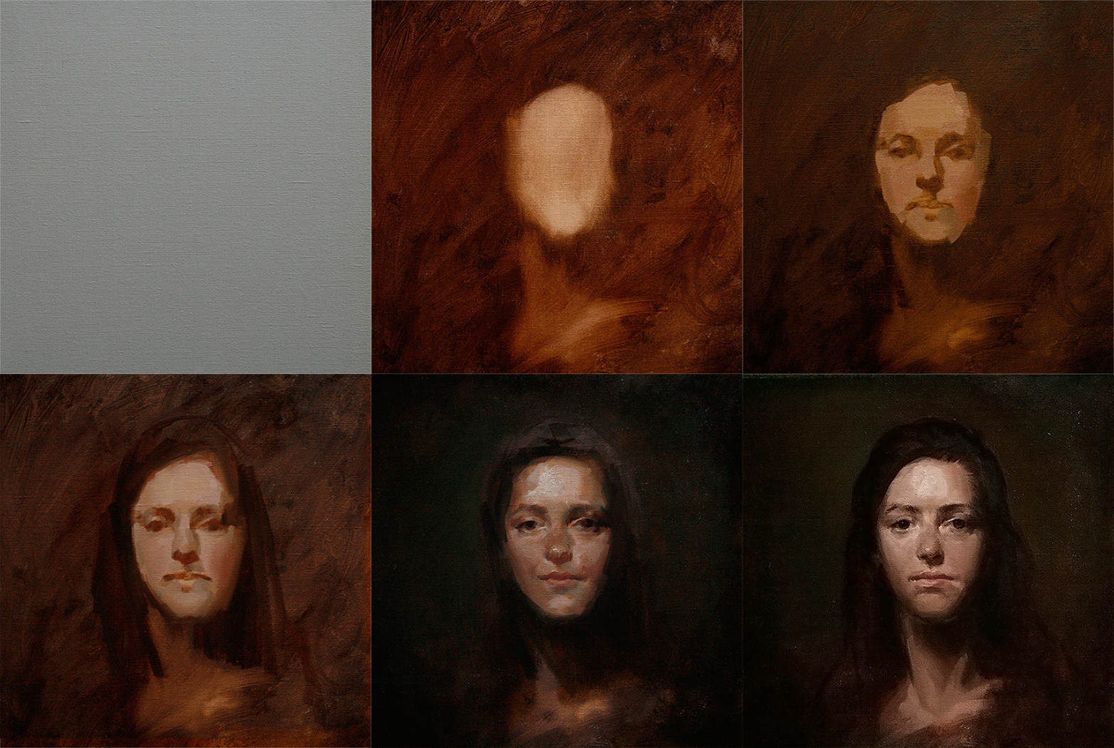
I start with a Transparent red oxide wash, i wanted to show at later stages of the painting particularity in the dark and textured areas(hair, cast shadows, parts of background) some of its color
I now introduce paint on the canvas, i like the way the colors blend wet on wet, by having a layer of somewhat thicker paint on for the skin, it allows me to model without going to far out the range of its value(because the colors blend on the canvas), applying the biggest planes first moving slowing to smaller places. Something to beware at this stage is that drawing is not done separately, that one has to draw with the brush at all times.
Once the face and likeness starts to take shape i remind myself not to drift too far off from the initial idea for this painting, the pencil sketch, so i darken the background. Also i start to implement some impasto, there's is two different effects that i went for, impasto as a relief(in reverse) effect, so whatever is closer to the viewer(in form) is thicker, some i got from studying Rembrandts work). And thick brush marks for high lights, as the lights sits on the paint, it gives a brighter effect. If one knows that the painting is going to be lit from, lets say a spot light from above, the horizontal thick brush marks will caught more of the light.
After refining the edges on the face i start slowly introducing the background and the edge of the hair. Checking the value of the face against the background for the overall balance, keeping it fairly dark and soft, both in value and color. The background is a great tool to complement the portrait but have to be careful not to over do it. Once i think such balance has been achieve i stop. I realize next day that the overall temperature might have been a bit too warm on the face, so i let it dry (is oils so is going to be a while!) as i see the only "easy" solution at this point is to glaze.
After the painting is dry i glaze/scumble a cooler tone over for the skin and give final touches using the same technique on the whole painting. This is a very safe to work because at any given point i can always go back to the dry paint.


Thank you for showing your process.
ReplyDeleteI'm not sure if you'd like some feedback?
To me the left part of her face looks wider than the right one. Particularly the eye.
Also I liked how the shape of the hair in the drawing created a S-curve (the left of the drawing). But there is no such curve in the painting. I feel that it made the picture stronger compositionally.
Just felt like sharing some thoughts.
Thank you for sharing Mihail!
DeleteI super agree with the eye, and looking it now after your feedback i can clearly see that i should've been more careful with the height of the eye lid and the shadow-shape on the right. Same goes for the cheek! *face palm*! ;) is always the drawing...
Thank you Mihail, your honesty and help is appreciated ! :3
http://i4.photobucket.com/albums/y112/Call0ps/_MG_8824copy_zps0f1866e3.jpg~original
Delete;)
Look at her lower lip. Does it seem like it's a bit displaced to the left of the painting, as if she moved her jaw to the side?
ReplyDeleteIt looks somewhat asymmetrical to me.
:(
DeleteThanks for sharing your process it is good and very interesting to see. As I was lucky enough to see this on the easel as it was be painted I know that my tiny computer screen does not show it in it's full glory but I do think you have done well taking your photos of it as oils are not the easiest things to photograph.
ReplyDeleteMany thanks for putting this up. I found it very useful and interesting!
ReplyDelete